Interior Design Color Psychology: How Colors Affect Mood and Productivity
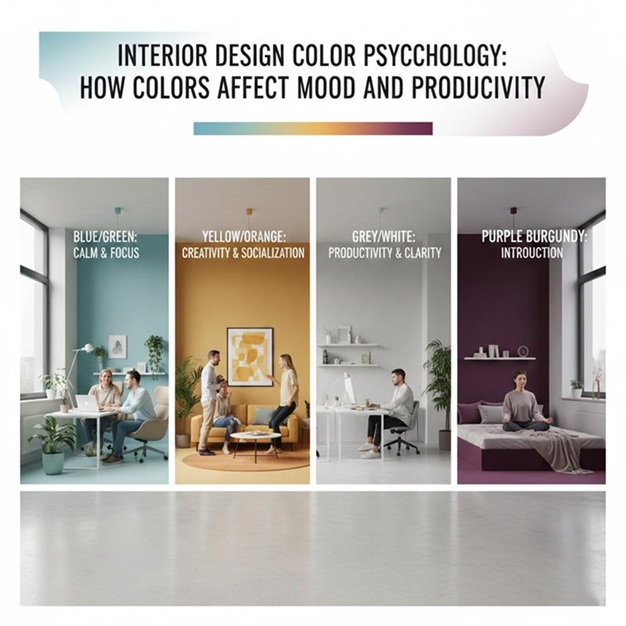
Most people choose colours for their home based on what they like at first glance. A shade looks nice in a store or on a phone screen, so it ends up on a wall. Sometimes that works out. Other times, a room just feels off, even though nothing is technically wrong.
That strange feeling often comes down to colour.
Colours affect us quietly. We don’t always notice it, but they influence how alert we feel, how relaxed we are, and even how long we can focus on a task. That’s why the same person might feel calm in one room and restless in another, even if both rooms are clean and well organised.
Understanding colour psychology doesn’t mean following strict rules. It just helps you make choices that support how you actually live in your space.
How Colour Shapes Mood Without Us Realising
Colour works on the brain before logic steps in. You don’t think about it. You feel it.
Bright colours can make the heart rate rise slightly. Softer tones can slow things down. Some shades feel comforting, while others push energy outward. This happens even if you don’t consciously like or dislike the colour.
Daily mood is closely tied to the spaces we spend the most time in. If a room feels too intense, it can cause restlessness. If it feels too dull, it can drain motivation.
That’s why intentional colour choices matter. A home isn’t just something you look at. It’s something you live inside for hours every day.
When colours support the purpose of a space, daily life feels easier. You don’t fight the room. It works with you.
Warm Colours and How They Affect Energy
Warm colours like red, orange, and yellow tend to carry energy. They pull attention and create movement in a space.
Red is strong. It can increase alertness and emotion. In small doses, it feels bold and confident. In large amounts, it can feel overwhelming or even stressful. That’s why it’s rarely comfortable as a main colour in areas meant for rest.
Orange feels social. It encourages conversation and warmth. It works well in places where people gather, but too much of it can feel loud over time.
Yellow often feels cheerful and optimistic. Lighter yellows can brighten a space that lacks natural light. Strong yellows, however, can become tiring if they dominate a room.
Warm tones are best used where activity happens. Dining areas, social spaces, or kitchens can benefit from these colours because they support interaction and movement.
The key is balance. Warm colours don’t need to cover every wall. Sometimes they work best as accents, furniture, or small design details.
Cool Colours and Their Effect on Calm and Focus
Cool colours tend to move in the opposite direction. Blues, greens, and soft purples slow things down mentally.
Blue is often linked to calm and concentration. It helps reduce mental noise and supports focus. That’s why it’s commonly used in bedrooms and workspaces.
Green sits somewhere between calm and energy. It feels natural and grounding, which makes it easy to live with long-term. Green works well in almost any room because it doesn’t demand attention.
Soft purples can feel reflective and peaceful when used carefully. Very dark or bright purples, however, can feel heavy if overused.
Cool tones are especially useful in spaces meant for rest or focused thinking. Bedrooms, home offices, and study areas often benefit from these colours because they help the mind settle. When paired with a thoughtfully styled bedside table in complementary shades, these cool hues create a calm and balanced atmosphere that supports relaxation and mental clarity.
Muted shades work better than intense ones. When cool colours are too saturated, they can feel cold instead of calming.
The Quiet Power of Neutral Colours
Neutral colours often get dismissed as boring, but they play an important role in how a home feels.
Whites, beiges, and greys create visual rest. They give the eyes a break and allow other elements to stand out without competing for attention.
White can feel clean and open, but it can also feel empty if it’s too stark. Warmer whites tend to feel more comfortable than pure bright white.
Beige brings warmth and softness. It creates a sense of stability, especially in shared spaces.
Grey is neutral and grounding, but it needs warmth to avoid feeling flat. Without texture or contrast, grey spaces can feel dull over time.
Neutral colours are flexible. They adapt to different moods, styles, and seasons. That’s why they work well as base colours.
Adding texture is what keeps neutrals interesting. Fabrics, wood, and layered materials stop neutral spaces from feeling lifeless.
Using Colour to Support Productivity
Productivity isn’t just about discipline. Environment plays a big role.
Some colours help the brain focus longer. Others distract without us realising.
Soft blues and greens are often effective in workspaces because they reduce mental clutter. They don’t pull attention away from tasks.
Touches of warm colour can support creativity. A small amount of yellow or orange can help energise thinking without overwhelming focus.
Colour placement matters too. A bold colour behind a computer desk might feel stimulating at first but become distracting over time. Softer colours in the main field of vision usually work better, helping maintain focus and visual comfort during long hours of work.
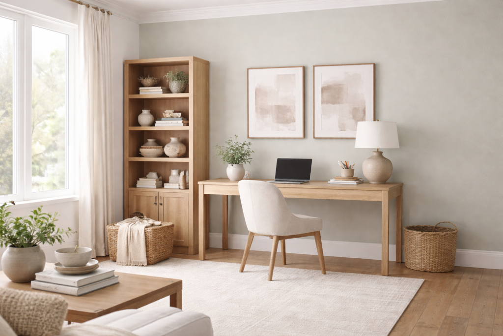
Lighting changes how colour behaves. Natural light makes colours feel lighter and more open. Artificial light can deepen or dull shades. This should always be considered when choosing colours for work areas.
Personal preference matters. If a colour feels uncomfortable to you, it won’t support productivity no matter what theory says.
Finding Balance Across the Home
A home doesn’t need every room to feel the same, but it should feel connected.
Too many strong colours competing across rooms can create mental fatigue. Moving from one intense space to another feels unsettling.
Balancing colours means mixing warm and cool tones in a way that feels natural. A calm base with small energetic accents often works well.
Accent colours are most effective when they are used intentionally. Cushions, artwork, or small decor pieces allow colour without commitment.
Harmony matters more than trends. A colour scheme that feels balanced will always feel better than one chosen purely for appearance.
Each space should support how it’s used. Rest areas should calm the mind. Work areas should support focus. Social areas should feel welcoming.
Final Thoughts
Colour is one of the most powerful tools in interior design, yet it’s often chosen without much thought.
The right colours don’t just make a home look good. They influence how you feel throughout the day. They shape energy levels, focus, and comfort in ways that are easy to overlook.
There’s no single correct palette. What matters is awareness. When colour choices support daily life instead of fighting it, the home feels easier to live in.
And that quiet ease is what good design is really about.